
Linear Regression 101 (Part 3 - Assumptions & Evaluation)

Introduction
We covered tha basics of linear regression in Part 1 and key model metrics were explored in Part 2. Now we’re ready to tackle the basic assumptions of linear regression, how to investigate whether those assumptions are met, and how to address key problems in this final post of a 3-part series.
Linear Regression Assumptions
- Linear relationship between target and features
- No outliers
- No high-leverage points
- Homoscedasticity of error terms
- Uncorrelated error terms
- Independent features
Let’s dig deeper into each of these assumptions one at a time.
#1 Linear Relationship Between Target & Features
The first thing we need to do is generate some linear data. Here’s the code:
import numpy as np
np.random.seed(20)
x = np.arange(20)
y = [x*2 + np.random.rand(1)*4 for x in range(20)]
Next, we need to reshape the array named x because sklearn requires a 2D array.
x_reshape = x.reshape(-1,1)
Technical note: we’re faking a 2D array here by using the .reshape(-1,1) method.
On to fitting the model with sklearn:
from sklearn.linear_model import LinearRegression
linear = LinearRegression()
linear.fit(x_reshape, y)
And now a plot of the data and resulting linear regression line.
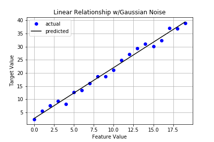
It certainly looks pretty good but let’s capture key metrics as discussed in the previous post. To do that, we’ll borrow the Stats class from that post. Here’s the code again:
class Stats:

    def __init__(self, X, y, model):
        self.data = X
        self.target = y
        self.model = model
        ## degrees of freedom population dep. variable variance
        self._dft = X.shape[0] - 1
        ## degrees of freedom population error variance
        self._dfe = X.shape[0] - X.shape[1] - 1

    def sse(self):
        '''returns sum of squared errors (model vs actual)'''
        squared_errors = (self.target - self.model.predict(self.data)) ** 2
        return np.sum(squared_errors)

    def sst(self):
        '''returns total sum of squared errors (actual vs avg(actual))'''
        avg_y = np.mean(self.target)
        squared_errors = (self.target - avg_y) ** 2
        return np.sum(squared_errors)

    def r_squared(self):
        '''returns calculated value of r^2'''
        return 1 - self.sse()/self.sst()

    def adj_r_squared(self):
        '''returns calculated value of adjusted r^2'''
        return 1 - (self.sse()/self._dfe) / (self.sst()/self._dft)
If you read that post, you’ll remember we created a pretty print function that will generate a nice looking report. Here’s that bit of code:
def pretty_print_stats(stats_obj):
    '''returns report of statistics for a given model object'''
    items = ( ('sse:', stats_obj.sse()), ('sst:', stats_obj.sst()),
             ('r^2:', stats_obj.r_squared()), ('adj_r^2:', stats_obj.adj_r_squared()) )
    for item in items:
        print('{0:8} {1:.4f}'.format(item[0], item[1]))
Alright, we’re all set. Time to instantiate and generate that report.
s1 = Stats(x_reshape, y, linear)
pretty_print_stats(s1)
The output is:
sse:     24.3975
sst:     2502.9934
r^2:     0.9903
adj_r^2: 0.9897
Not surprisingly, our results look good across the board.
Potential Problem: Data w/Nonlinear Pattern
y_nonlinear = [x**3 + np.random.rand(1)*10 for x in range(20)]
nonlinear = LinearRegression()
nonlinear.fit(x_reshape, y_nonlinear)
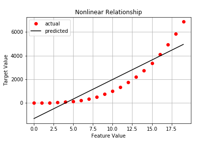
Capturing stats on the nonlinear data gives us:
sse:     14702044.1585
sst:     87205080.0323
r^2:     0.8314
adj_r^2: 0.8220
No surprise, we see a substantial increases in both SSE and SST as well as substantial decreases in R^2 and adjusted R^2.
Considerations
We can check to see if our model is capturing the underlying pattern effectively. Specifically, let’s generate side-by-side Residual Plots for the linear case and the nonlinear case.
import matplotlib.pyplot as plt

fig, axes = plt.subplots(1, 2, sharex=False, sharey=False)
fig.suptitle('[Residual Plots]')
fig.set_size_inches(12,5)
axes[0].plot(linear.predict(x_reshape), y-linear.predict(x_reshape), 'bo')
axes[0].axhline(y=0, color='k')
axes[0].grid()
axes[0].set_title('Linear')
axes[0].set_xlabel('predicted values')
axes[0].set_ylabel('residuals')
axes[1].plot(nonlinear.predict(x_reshape), y_nonlinear-nonlinear.predict(x_reshape), 'ro')
axes[1].axhline(y=0, color='k')
axes[1].grid()
axes[1].set_title('Non-Linear')
axes[1].set_xlabel('predicted values')
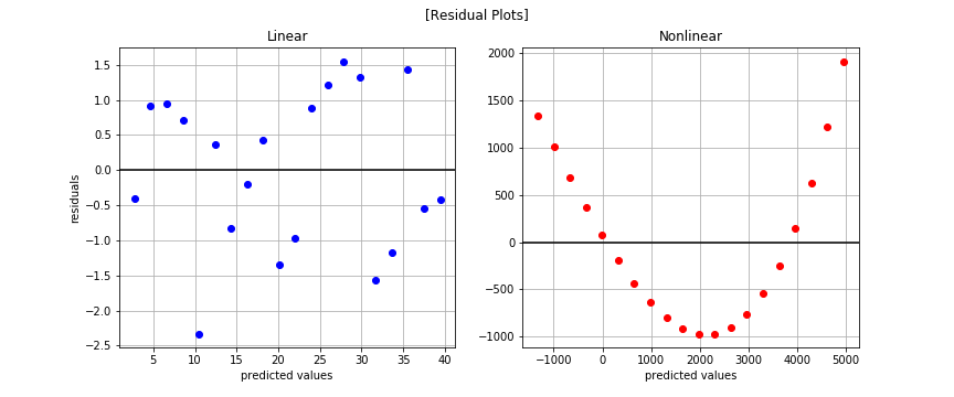
The nonlinear pattern is overwhelmingly obvious in the residual plots. You may be wondering why we bothered plotting at all since we saw the nonlinear trend when plotting the observed data. That works well for low dimensional cases that are easy to visualize but how will you know if you have more than 2-3 features? The residual plot is a powerful tool in that case and something you should leverage often.
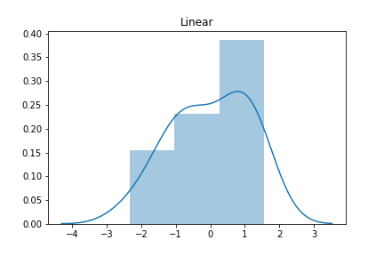
Let’s now plot a histogram of residuals to see if they’re Normally distributed for the linear case.
import seaborn as sns

residuals_linear = y - linear.predict(x_reshape)
residuals_nlinear = y_nonlinear - nonlinear.predict(x_reshape)

sns.distplot(residuals_linear);
plt.title('Linear')
And now for the nonlinear case.
sns.distplot(residuals_nlinear)
plt.title('Non-Linear')
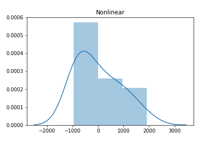
The histogram of the linear model on linear data looks approximately Normal (aka Gaussian) while the second histogram shows a skew. But is there a more quantitative method to test for Normality? Absolutely. SciPy has a normaltest method. Let’s see it in action.
from scipy.stats import normaltest
normaltest(residuals_linear)
The output:
NormaltestResult(statistic=array([ 1.71234546]), pvalue=array([ 0.42478474]))
The null hypothesis is that the residual distribution is Normally distributed. Since the p-value > 0.05, we cannot reject the null. In other words, we can confidently say the residuals are Normally distributed.
And for the nonlinear data?
normaltest(residuals_nlinear)
The output:
NormaltestResult(statistic=array([ 2.20019716]), pvalue=array([ 0.33283827]))
Turns out the residuals for the nonlinear function are Normally distributed as well.
Takeaway
The linear data exhibits a fair amount of randomness centered around 0 in the residual plot indicating our model has captured nearly all the discernable pattern. On the other hand, the nonlinear data shows a clear nonlinear trend. In other words, using the nonlinear data as-is with our linear model will result in a poor model fit.
Possible Solutions to Nonlinear Data
- Consider transforming the features
- Consider applying a different algorithm
Say we have a single feature x. Assuming we see a nonlinear pattern in the data, we can transform x such that linear regression can pickup the pattern. For example, perhaps there’s a quadratic relationship between x and y. We can model that simply by including x^2 in our data. The x^2 feature now gets its own parameter in the model. This process of modeling transformed features with polynomial terms is called polynomial regression. Let’s see it in action.
Polynomial Regression
from sklearn.pipeline import Pipeline
from sklearn.preprocessing import PolynomialFeatures

poly = Pipeline([('poly', PolynomialFeatures(degree=3)),
                  ('linear', LinearRegression(fit_intercept=False))])
poly.fit(x_reshape, y_nonlinear)
Now our plot looks like this:
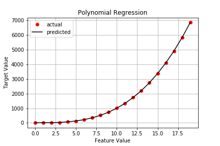
Checking the stats results in:
sse:     80.6927
sst:     87205080.0323
r^2:     1.0000
adj_r^2: 1.0000
Much better and it only took a few lines of code.
#2 No Outliers
As always, let’s start by generating our data, including an outlier.
np.random.seed(20)
x = np.arange(20)
y = [x*2 + np.random.rand(1)*4 for x in range(20)]
y_outlier = y.copy()
y_outlier[8] = np.array([38])  ## insert outlier
We’ll do the customary reshaping of our 1D x array and fit two models: one with the outlier and one without. Then we’ll investigate the impact on the various stats.
# sklearn expects 2D array so have to reshape x
x_reshape = x.reshape(-1,1)

# fit model w/standard data
linear_nooutlier = LinearRegression()
linear_nooutlier.fit(x_reshape, y);

# fit model w/outlier data
linear_outlier = LinearRegression()
linear_outlier.fit(x_reshape, y_outlier);
A plot for comparison:
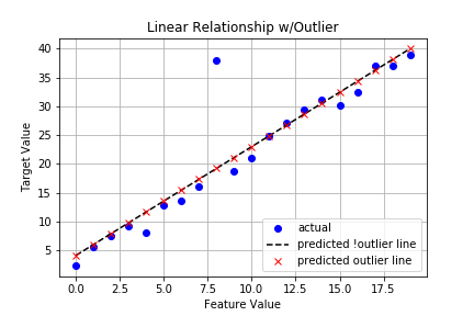
There doesn’t appear to be much difference in the lines, but are looks deceiving us? Let’s look at the key stats.
# no outlier
sse:     24.3975
sst:     2502.9934
r^2:     0.9903
adj_r^2: 0.9897

# w/outlier
sse:     396.3144
sst:     2764.0028
r^2:     0.8566
adj_r^2: 0.8487
That’s a pretty big difference in all metrics!
Possible Solutions
- Investigate the outlier(s). Do NOT assume these cases are just bad data. Some outliers are true examples while others are data entry errors. You need to know which it is before proceeding.
- Consider imputing or removing outliers.
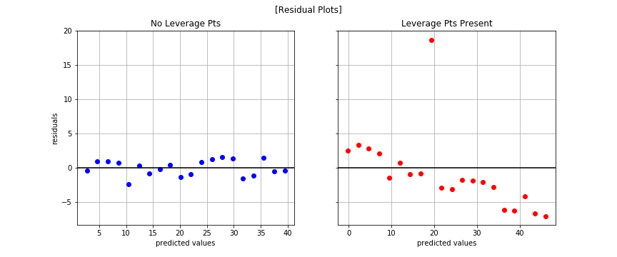
#3 No High-Leverage Points
You know the drill by now - generate data, transform x array, plot, check residuals, and discuss.
Generate Dummy Data
np.random.seed(20)
x = np.arange(20)
y_linear_leverage = [x*2 + np.random.rand(1)*4 for x in range(20)]
y_linear_leverage[18] = np.array([55])  ## high-leverage point
y_linear_leverage[19] = np.array([58])  ## high-leverage point
Reshape x
x_reshape = x.reshape(-1,1)
Fit Model
linear_leverage = LinearRegression()
linear_leverage.fit(x_reshape, y_linear_leverage)
Plot
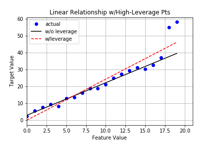
Stats
# linear (no leverage)
sse:     24.3975
sst:     2502.9934
r^2:     0.9903
adj_r^2: 0.9897

# linear (w/leverage)
sse:     438.7579
sst:     4373.2096
r^2:     0.8997
adj_r^2: 0.8941
Residual Plots
Normal Test
normaltest(y_outlier-linear_leverage.predict(x_reshape))
With output:
NormaltestResult(statistic=array([ 25.3995098]), pvalue=array([ 3.05187348e-06]))
Fails! The residuals are not Normally distributed, statistically speaking that is. This is a key assumption of linear regression and we have violated it.
Takeaway
The high-leverage points not only act as outliers, they also greatly affect our model’s ability to generalize and our confidence in the model itself.
Possible Solutions
- Explore the data to understand why these data points exist. Are they true data points or mistakes of some kind?
- Consider imputing or removing them if outliers, but only if you have good reason to do so!
- Consider a more robust loss function (e.g. Huber).
- Consider a more robust algorithm (e.g. RANSAC).
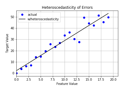
#4 Homoscedasticity of Error Terms
Homescedasticity means the errors exhibit constant variance. This is a key assumption of linear regression. Heteroscedasticity, on the other hand, is what happens when errors show some sort of growth. The tell tale sign you have heteroscedasticity is a fan-like shape in your residual plot. Let’s take a look.
Generate Dummy Data
np.random.seed(20)
x = np.arange(20)
y_homo = [x*2 + np.random.rand(1) for x in range(20)]  ## homoscedastic error
y_hetero = [x*2 + np.random.rand(1)*2*x for x in range(20)]  ## heteroscedastic error
Reshape x
x_reshape = x.reshape(-1,1)
Fit Model
linear_homo = LinearRegression()
linear_homo.fit(x_reshape, y_homo)

linear_hetero = LinearRegression()
linear_hetero.fit(x_reshape, y_hetero)
Plot
Residual Plot
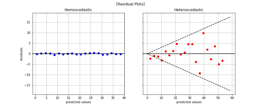
The fan-like shape is readily apparent in the plot to the right. That’s bad news for linear regression.
Normal Test
# homoscedastic data
normaltest(y_homo-linear_homo.predict(x_reshape))

# heteroscedastic data
normaltest(y_hetero-linear_hetero.predict(x_reshape))
With outputs, respectively:
NormaltestResult(statistic=array([ 1.71234546]), pvalue=array([ 0.42478474]))

NormaltestResult(statistic=array([ 1.04126656]), pvalue=array([ 0.59414417]))
There’s no reason to reject the null that both residual distributions are Normally distributed.
Takeaway
Standard errors, confidence intervals, and hypothesis tests rely on the assumption that errors are homoscedastic. If this assumption is violated, you cannot trust values for the those metrics!
Possible Solution
- Consider log transforming the target values
y_hetero_log = np.log10(np.array(y_hetero) + 1e1)
x_reshape_log = np.log10(np.array(x_reshape) + 1e1)

linear_hetero_log = LinearRegression()
linear_hetero_log.fit(x_reshape, y_hetero_log)

linear_hetero_log_log = LinearRegression()
linear_hetero_log_log.fit(x_reshape_log, y_hetero_log)
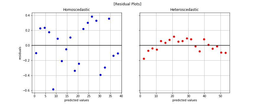
normaltest(y_hetero_log - linear_hetero_log.predict(x_reshape))
Output:
NormaltestResult(statistic=array([ 0.96954754]), pvalue=array([ 0.6158365]))
The plot on the right shows we addressed heteroscedasticity but there’a a fair amount of correlation amongst the errors. That brings us to our next assumption.
#5 Uncorrelated Error Terms
Same pattern…
Generate Dummy Data
np.random.seed(20)
x = np.arange(20)
y_uncorr = [2*x + np.random.rand(1) for x in range(20)]
y_corr = np.sin(x)
Reshape x
x_reshape = x.reshape(-1,1)
Fit Model
linear_uncorr = LinearRegression()
linear_uncorr.fit(x_reshape, y_uncorr)

linear_corr = LinearRegression()
linear_corr.fit(x_reshape, y_corr)
Residual Plot
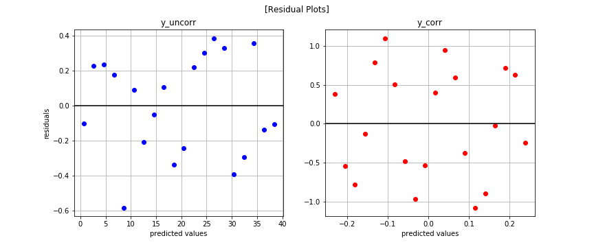
It’s not easy to see if any patterns exist. Let’s try plotting another way.
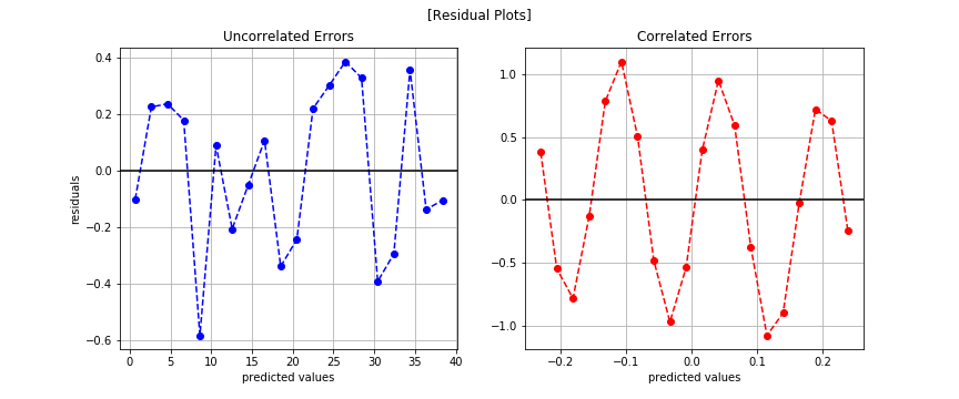
Now we can see the correlated errors.
Possible Solution
- Forget linear regression. Use time series modeling instead.
We’ll discuss time series modeling in detail in another post. For now, just know correlated errors is a problem for linear regression because linear regression expects records to be i.i.d.
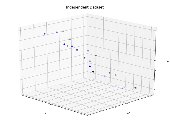
#6 Independent features
Independent features means no feature is an any way derived from the other features. For example, imagine a simple dataset with three features. The first two features are in no way related. However, the third is simply the sum of the first two features. That means this ficitonal dataset has one linearly dependent feature. That’s a problem for linear regression. Let’s take a look.
Generate Dummy Data
np.random.seed(39)
x1 = np.arange(20) * 2
x2 = np.random.randint(low=0, high=50, size=20)
x_idp = np.vstack((x1,x2))
y = np.add( np.sum(x_idp, axis=0), np.random.randn(20)*5 )  ## y = x1 + x2 + noise
Plot
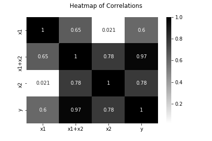
Create Linearly Dependent Feature
import pandas as pd
dp_df = pd.DataFrame([x1,x2,(x1+x2)]).T
Heatmap of Feature Correlations
Fit Models
lr_idp = LinearRegression()
lr_idp.fit(x_idp.T, y)

lr_dp = LinearRegression()
lr_dp.fit(dp_df, y)
Stats
# linearly independent features
sse:     361.5308
sst:     6898.6751
r^2:     0.9476
adj_r^2: 0.9414

# linearly dependent features
sse:     361.5308
sst:     6898.6751
r^2:     0.9476
adj_r^2: 0.9378
We see no difference in SSE, SST, or R^2. As we learned in the previous post about metrics, adjusted R^2 is telling us that the additional feature in the linearly dependent feature set adds no new information, which is why we see a decrease in that value. Be careful because linear regression assumes independent features, and looking at simple metrics like SSE, SST, and R^2 alone won’t tip you off that your features are correlated.
So what’s the big problem?
In short, interpretability. Say we have a simple model defined as: output = 2 + 12*x1 - 3*x2. Assuming independent features, we can interpret this model in the following way. A one unit increase in x1 results in an increase of 12 units of output. Likewise, a one unit increase in x2 results in a decrease of 3 units of output. This is the beauty of linear regression. However, if features are correlated, you lose the ability to interpret the linear regression model because you violate a fundamental assumption.
If all you care about is performance, then correlated features may not be a big deal. If, however, you care about interpretability, your features must be independent. There’s no two ways about it.
How do you check that features are independent?
There are a number of methods you can leverage to investigate feature-feature correlation. Calculate the rank of your data matrix or take the dot product of any two given features. The latter will result in 0 if two features are truly independent and some nonzero value if they are not. The larger the magnitude of the dot product, the greater the correlation. You can also leverage a basis transformation technique like Principal Component Analysis (PCA) to ensure all features are truly independent, though you lose some interpretability.
Wrap Up
Thus concludes our whirlwind tour of linear regression. By no means did we cover everything. For example, we didn’t talk about Q-Q plots or Maximum Likelihood Estimation (MLE) and how it drives Ordinary Least Squares (OLS). However, this post and the two prior should give you a deep enough fluency to effectively build models, to know when things go wrong, to know what those things are, and what to do about them.
Lastly, I hope you found this series helpful. If you found errata, please do let me know.